Micro-interactions, macro impact

What are micro-interactions?
Much like how we rely on feedback (visual, spoken, etc) when interacting with other humans, systems and digital products depend on small changes within an interface to communicate a form of response to us when an action has been performed.
We call these small instances micro-interactions. Think of them like the body language of a website – small non-verbal gestures that help you, the audience, derive greater meaning.
At some point upon landing on this page, you would have taken a quick glance at the length of the scrollbar on the right as you scrolled in order to evaluate how much you would have to get through before reaching the end of this article (don’t worry, I don’t judge).
The scrollbar, in its rudimentary form, is an example of a standard micro-interaction.

Source: Dribbble
Scrollbars are an effective way to display real-time visual feedback as they register your input as a user when you change your location on a page by scrolling. It not only shows you where you are on a page but also serves as a pseudo-progress bar that shows you just how close you are to reaching the end.
There are various types of micro-interactions that exist and they continue to evolve alongside the further advancements in technology available to us today.
Why are they important?
Micro-interactions go hand-in-hand with usability but are often overlooked because they are, you’ve guessed it – micro in size. They might not seem like much on their own but collectively they have a huge impact on the overall user experience of a design.
Here are a few reasons why they are important:
System Context
Micro-interactions are a necessity in providing context and clarity to a user when using a system.
Going back to the above example, if we were to remove the scrollbar from this page but retain the functionality of your scroll, you would still be able to navigate up and down this page but not knowing where you are on a page or how close you are to the end would most certainly be considered a pain point.
Scrollbars, progress bars, and notifications all aid in providing a clear picture of what is happening behind the scenes in response to a user’s actions. These elements also exist to ensure that you do not get lost in a labyrinth of states within particularly complex systems.

Increased User Engagement
An enjoyable experience also means more than just usability.
The time and effort invested in micro-interactions are what separates the exceptional from an otherwise ordinary experience, and this is something we advocate strongly for in our projects.
Animation is a perfect resource when used alongside micro-interactions to create engaging experiences – consider an animated loader versus a static counter, which of the two is more appealing to look at? The more enjoyable it is to use a product, the more likely it is for a user to revisit it over competitors.
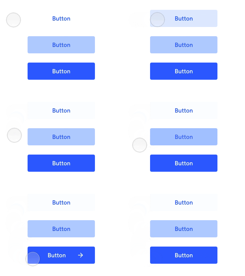
Take hover states for an example – a button may already look like it can be interacted with but add in an animated roll-over state and it no longer looks flat and sterile. This adds a level of finesse that can help contribute to the overall look and feel of a product or service.

Netflix’s smooth horizontal scrolls, Facebook’s animated emojis, and Instagram’s ‘like’ hearts are all examples of micro-interactions that not only benefit the user but also play a role in building brand credibility and personality.

Error Prevention
A system that effectively mitigates errors and offers real-time solutions ensures a smooth user experience.
An example of error prevention would be the display of help text that updates dynamically as a user fills in a form. These requirements, when communicated effectively through the use of micro-interactions, prevent the user from being presented with an error in the first place.
This then removes the need for the user to re-enter details for a second time. If an error does take place, micro-interactions in the form of error messages can also provide options for a user to diagnose and resolve the issue at hand.

Similarly, providing suggestions when a keyword returns zero search results presents a user with further options of interaction instead of being stuck on the page.
Microinteractions: a small gesture with big impact
Micro-interactions play a very specific role in a system and have the potential to make or break your user experience. It shouldn’t be considered expendable but instead should be actively invested in to ensure the best possible outcome for the end user.
The next time you’re tasked with improving the user experience of your product, why not have a look at micro-interactions?
Recommended Links

Tools to level-up your remote workplace practices
Over the past few years, many workplaces have experienced a major shift in their attitudes towards remote work, where it has transitioned from an anomaly to the new normal.

How remote workplaces can boost team collaboration
Even after years of working together in a remote or hybrid workplace, some teams may still be communicating ineffectively. It’s worth reviewing and implementing improved communication strategies before collaborating at a distance becomes overwhelming or too difficult for some team members. Here’s how to ensure your team feels on track and heard, even when miles apart.